Visualizing data with Panpipes
This tutorial guides you through the visualization of single-cell data using Panpipes. The workflow describes the steps run by the pipeline in greater detail.
The vis workflow can be run after any of the other Panpipes workflows and visualizes the data in e.g. UMAPs, PCA, barplots, etc. It expects a MuData object as input.
For all the tutorials, we will append the --local command which ensures that the pipeline runs on the computing node you’re currently on, namely your local machine or an interactive session on a computing node on a cluster.
Directories and data
In this tutorial, we will use the subset of the teaseq datasets that we also used in the Ingesting, Preprocessing, Integration, and Clustering tutorials. The data contains three modalities - RNA, ATAC, and protein. We will use the MuData object that we obtain after running the ingest, preprocess, and clustering workflows.
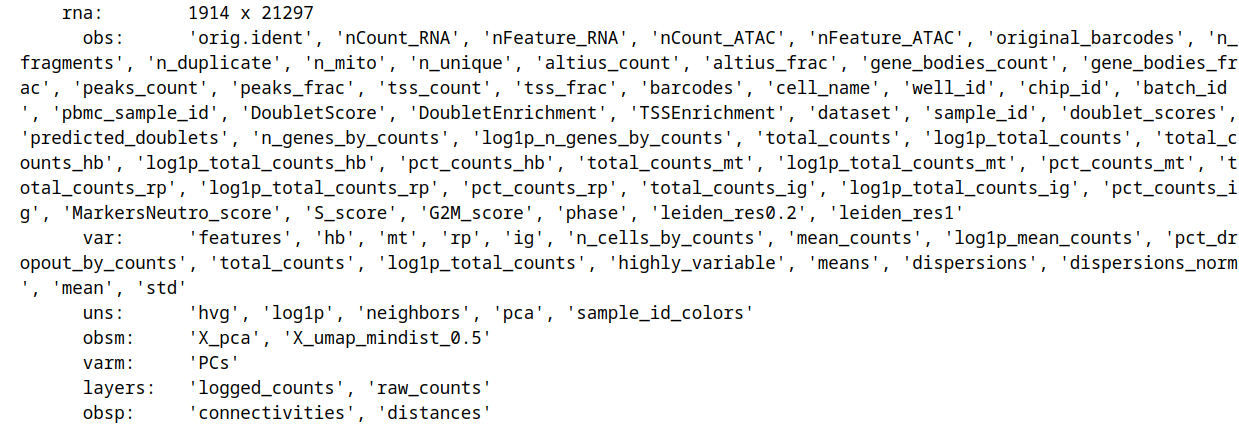
For the RNA modality, multiple QC metrics, as well as PCA and UMAP are present in the mdata.mod["rna"] slot:
Same goes for ATAC:

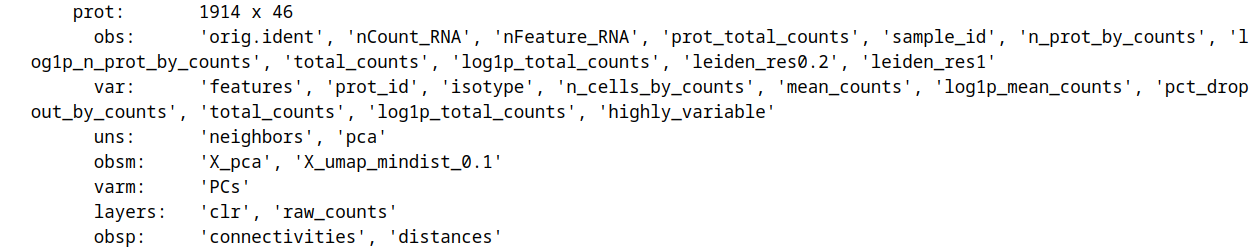
and protein:
We will be working in in the teaseq/vis directory and save the input MuData object into teaseq/vis/data:
mkdir teaseq teaseq/vis teaseq/vis/data
cd teaseq/vis
You can download the MuData object we will use for this tutorial here and save it to teaseq/vis/data.
After creating the directories and downloading the data, the folder structure looks as follows:
teaseq
├── vis
│   └── data
│       └──  teaseq_clustered.h5mu
Edit yaml file
To create the pipeline.log and a pipeline.yml file, call panpipes vis config in teaseq/vis (you potentially need to activate the conda environment with conda activate pipeline_env first!).
Modify the pipeline.yml or simply replace it with the yaml file we provide. In the yaml file, you can specify which categorical and continuous variables to plot and on which embeddings.
If you decide to use the provided yaml file for this tutorial, you may also download the needed csv-files of custom markers, paired markers, and paired metrics.
Run Panpipes
In teaseq/vis, run panpipes vis make full --local to visualize your data.
After successfully running the pipeline with the the provided yaml file, the vis folder contains a folder for each modality, in this case, rna, atac, and prot.
In each folder, you can find the embeddings (in our case PCA, UMAP) coloured by continuous variables. In this example, the PCA and UMAP of the RNA modality are coloured by rna:total_counts:


The embeddings are also coloured by the categorical variables that are specified in the yaml. In this example, the PCA and UMAP embeddings of the RNA modality are coloured by a leiden clustering, doublet detection results, and sample ID:


Besides the embedding plots, the pipeline also provides the possibility of (stacked) barplots for categorical variables and violin plots for continuous variables.
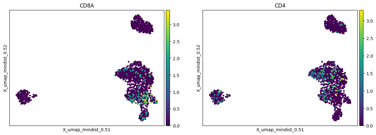
Plots of the custom markers that were specified in the custom markers csv file are also provided. The embeddings are coloured by the feature expression, additionally, dot plots and matrix plots are generated:


Note: We find that keeping the suggested directory structure (one main directory by project with all the individual steps in separate folders) is useful for project management. You can of course customize your directories as you prefer, and change the paths accordingly in the pipeline.yml config files!